Tips and Solutions for The Best Fall Palette 2025
September light begins to soften, and those crisp whites of summer start to feel just a touch too cool. The goal of a fall refresh isn’t to darken your home, but to warm up your Fall Palette 2025—setting the mood while still maintaining that easy, airy glow we all love.
Think oatmeal instead of stark white. Mushroom instead of cool gray. A whisper of camel, rust, or pumpkin tucked into your throws or layered across accent pillows. At Twilly & Fig Interiors, our Dallas-based design team helps clients across North Texas embrace the seasonal shift with a fresh take on fall interior design trends for Fall Palette 2025. By blending warm whites, thoughtful lighting, and soulful textures, we create beautifully livable spaces that feel timeless yet fresh.
Easy Ways to Warm Things Up (Without Losing Light)
Start with a Soft, Warm Base
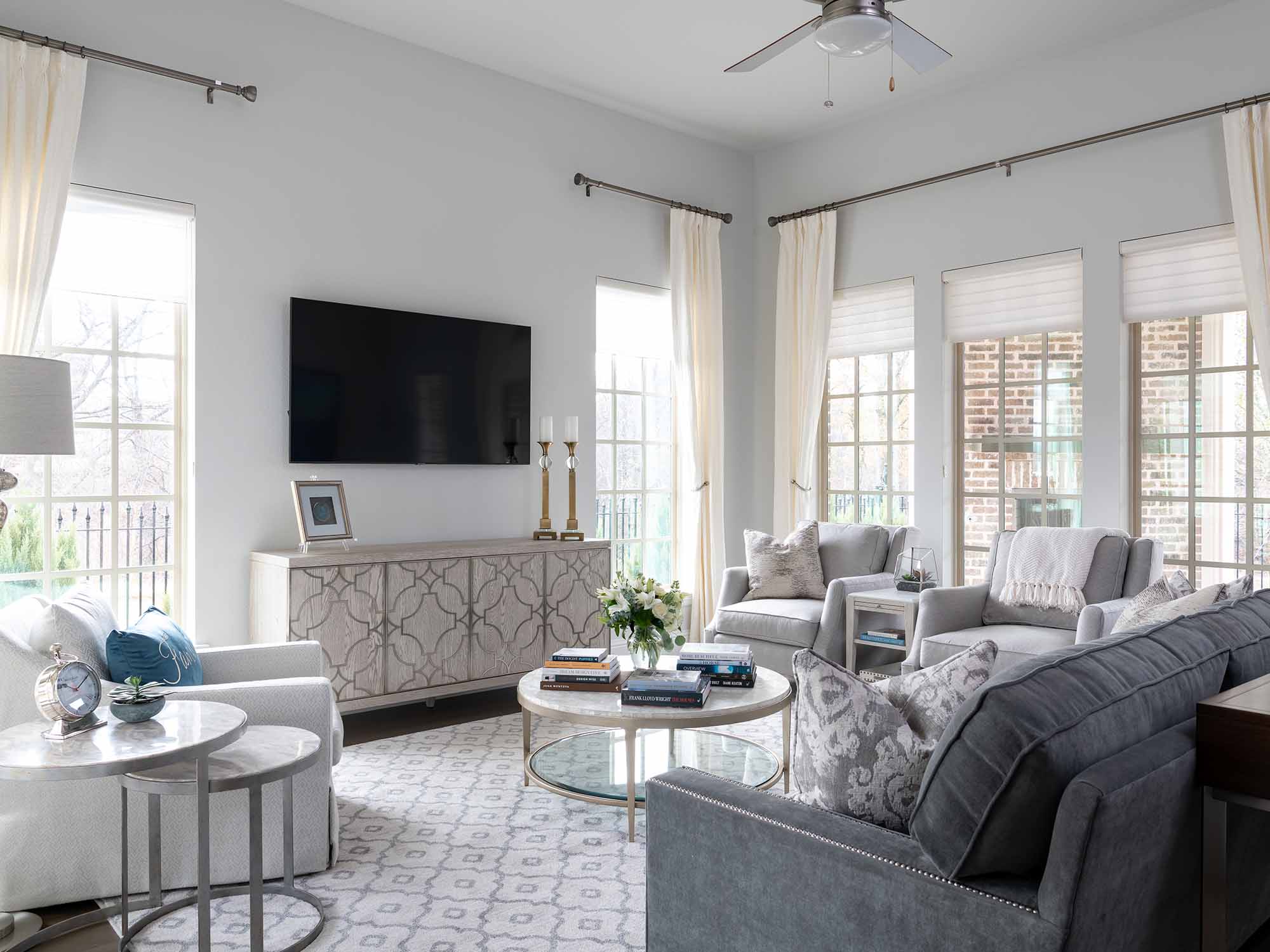
Start with a warm base. Try a soft white or one that reads cozy, not stark. If you love sunlight, look for light-reflecting options (think high-LRV paint that bounces light) so rooms stay bright while still feeling warm.
Coordinate with Your Floors
If your flooring leans cool—gray tile, pale oak—pair it with walls that introduce gentle warmth (like soft mushroom or greige). If you have warm wood floors (hello, walnut or honey oak), keep the wall tone creamy without going yellow. The goal? Cohesion, not contrast.
Contrast Calmly—Or Color Drench Boldly
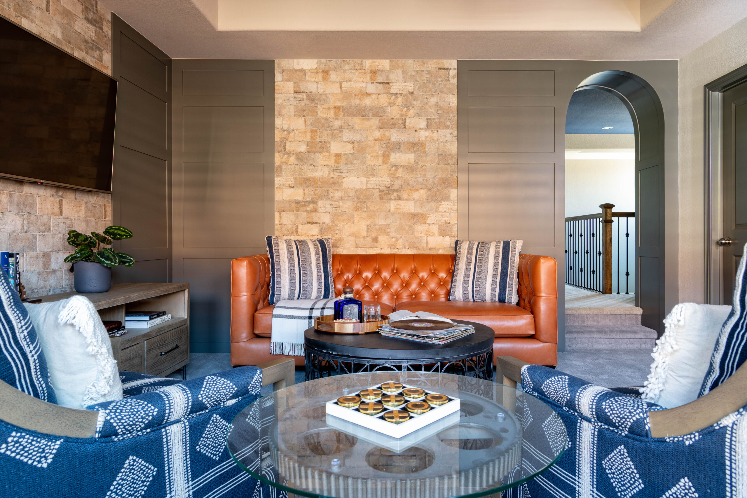
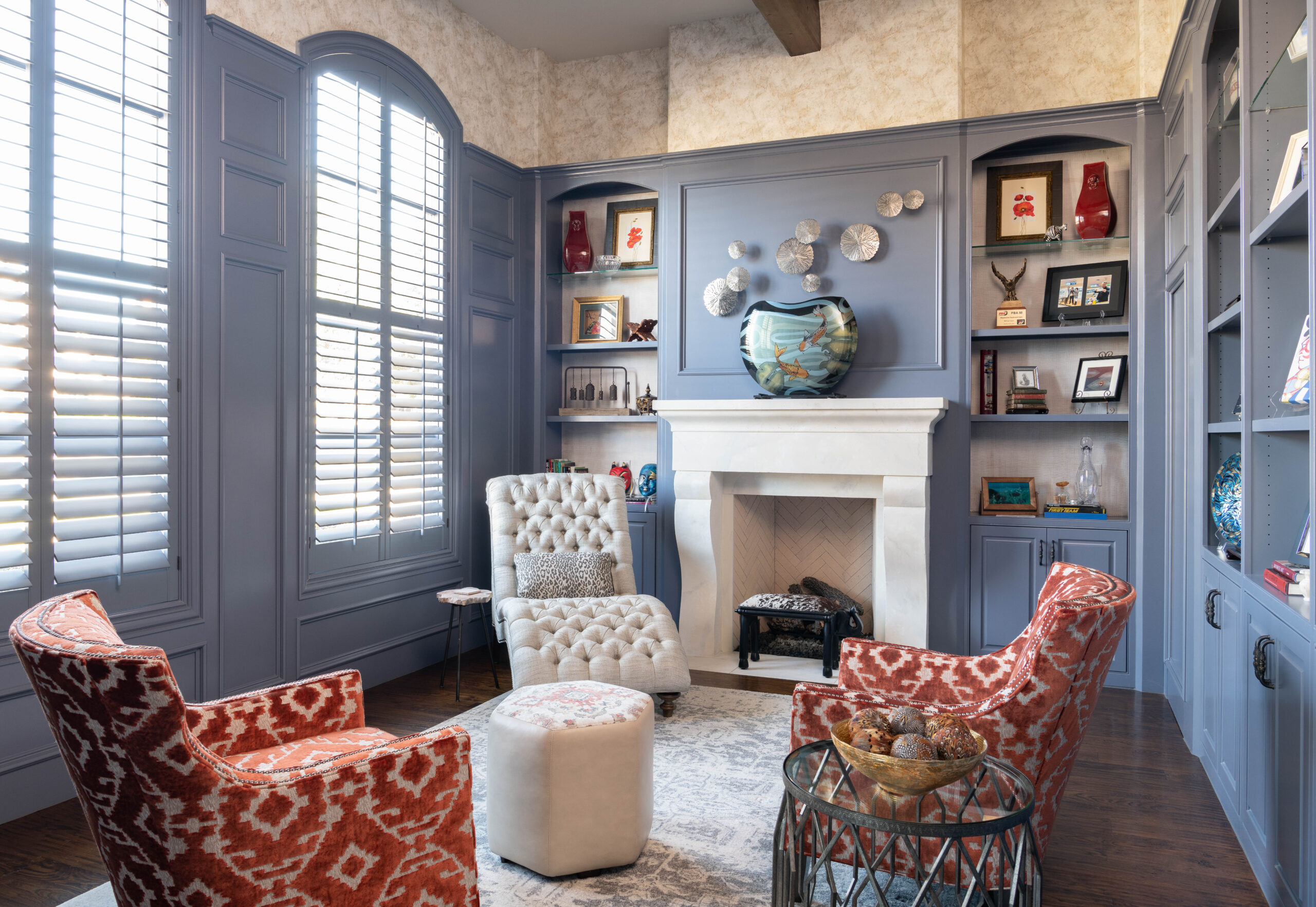
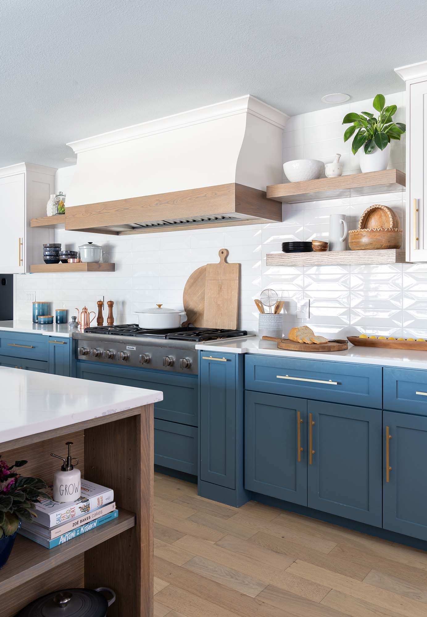
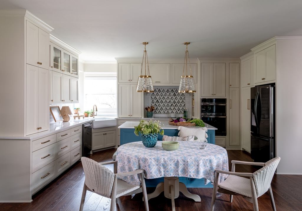
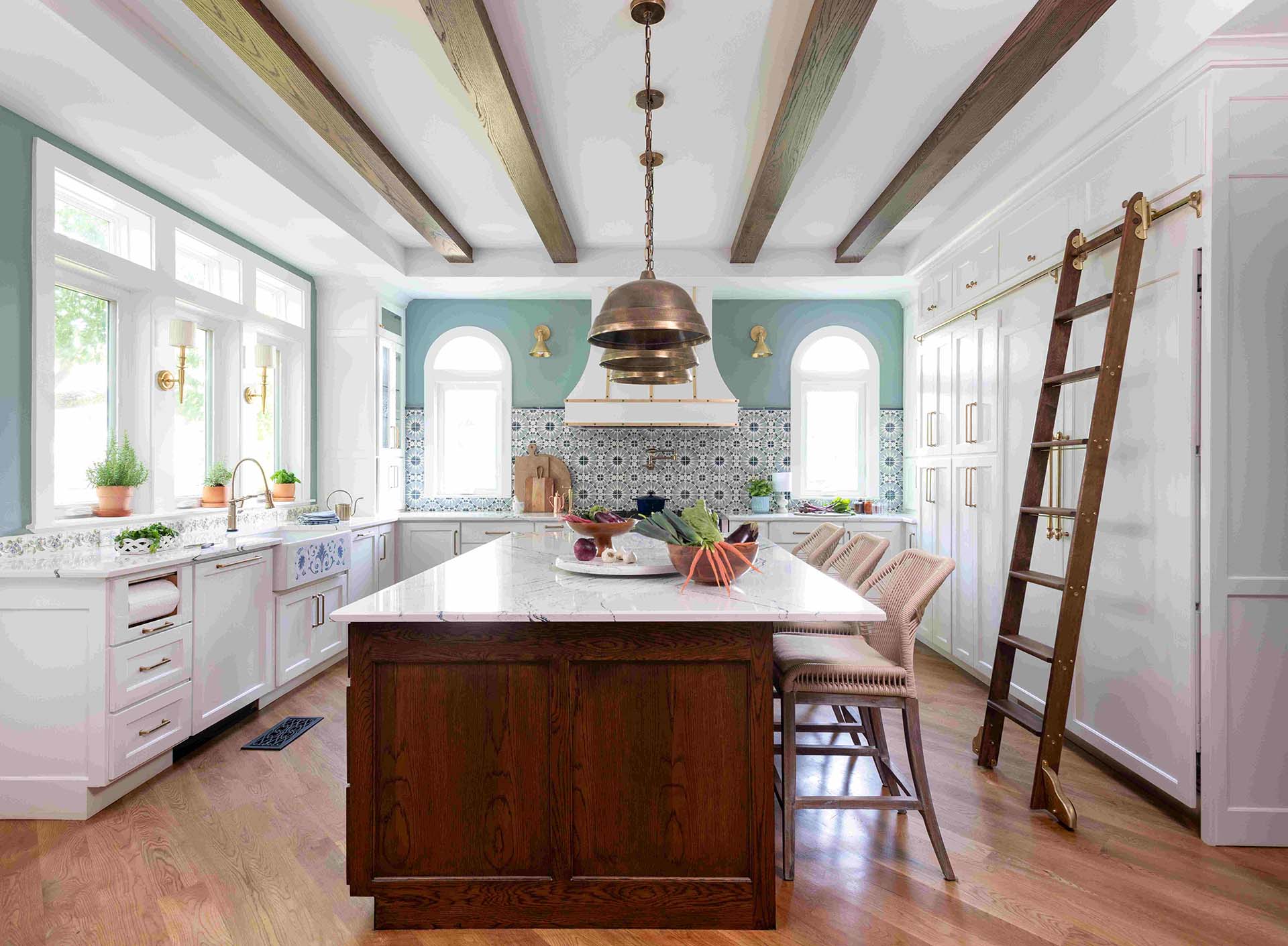
For depth without heaviness, try painting an island, built-in, or even ceiling beams in a deeper neutral such as Sherwin-Williams Mushroom, Clay, or Tobacco. If you’re feeling bold with your fall palette color, consider color drenching—wrapping walls, trim, and ceilings in one of these rich tones for a look that feels enveloping, architectural, and incredibly chic.
Mix Metals + Woods with Intention
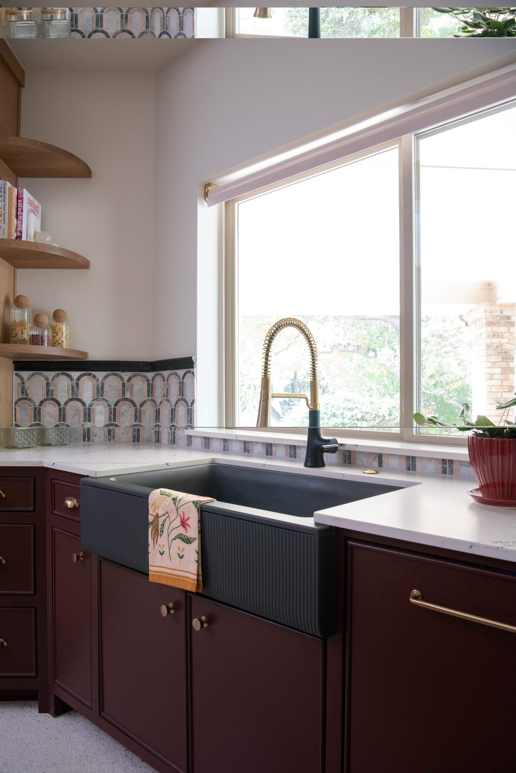
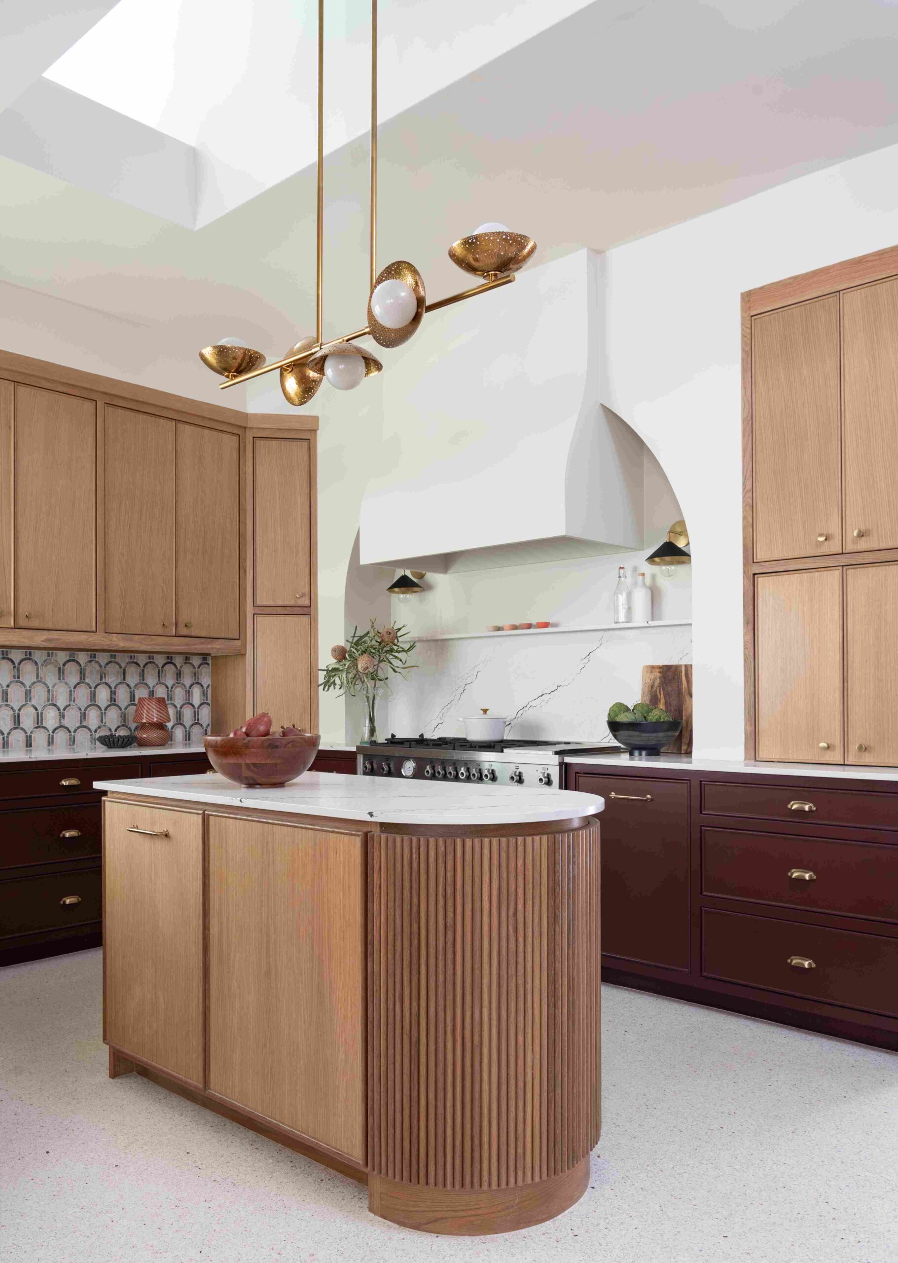
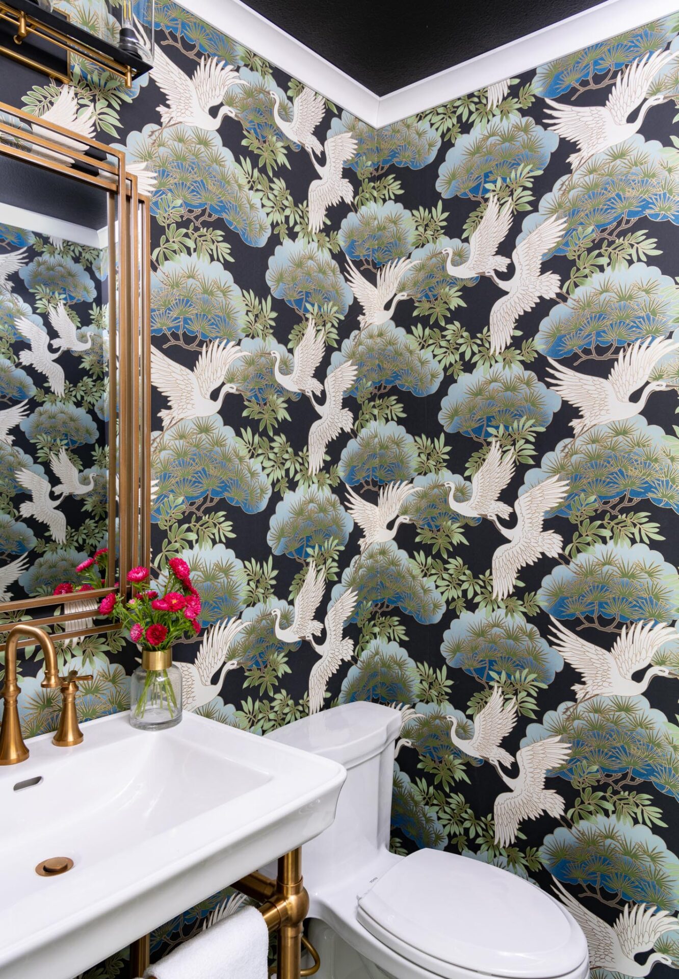
Metal mixing is still having a moment—but it’s not a free-for-all. Pick one metal as the hero, and let the second be a whisper. Our current fall palette crush? Brass and bronze. One gleams, one grounds.
When it comes to wood pairings, harmony is everything. White oak with walnut? Timeless. Too many conflicting tones? That’s visual noise. Create rhythm, not chaos.
Edit the Cool: Art, Rugs, and Florals
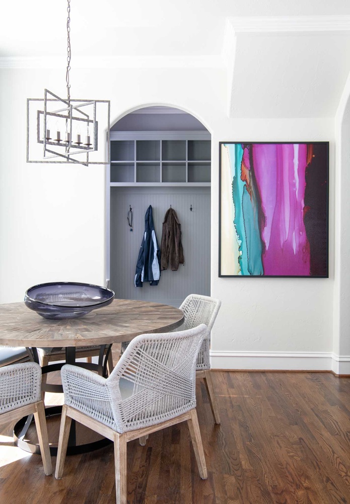
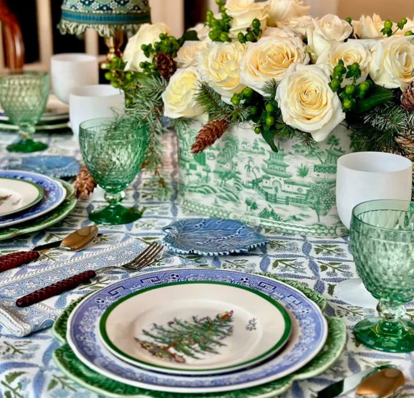
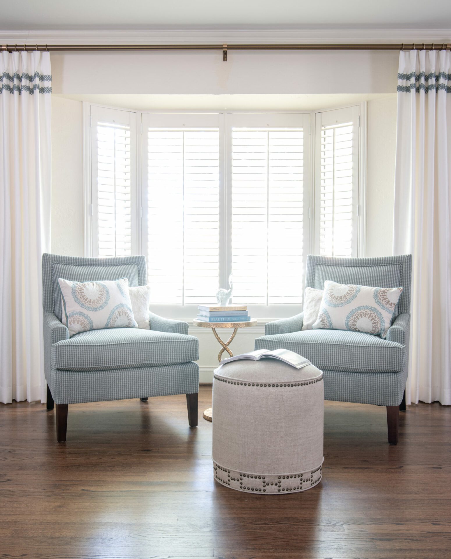
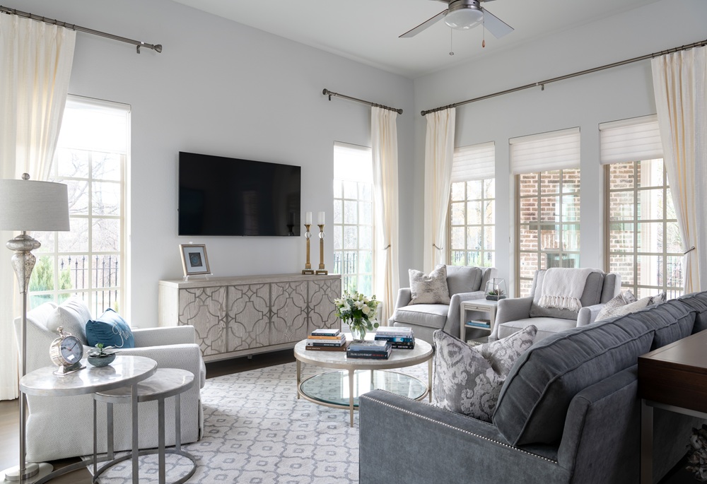
If your current space feels cold, it might not be the paint—it could be your art or textiles. Trade a blue-leaning rug or icy artwork for pieces in camel, oat, rust, or harvest gold. Add florals in rich, native fall tones, or sculptural vases in earthy glazes.
Lighting: The Unsung Hero of Cozy
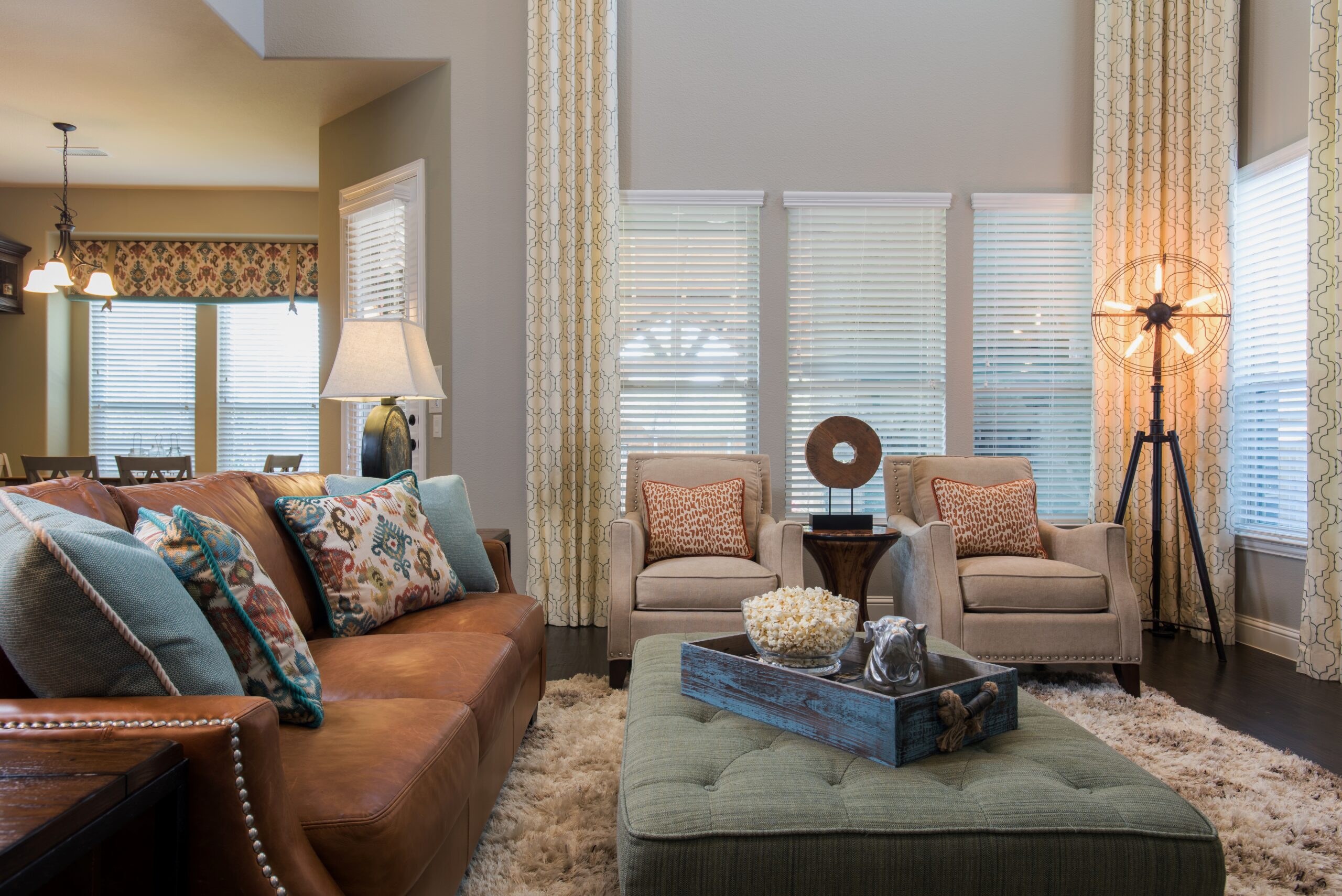
Swap harsh overheads for soft, ambient lighting. Add a table lamp, install dimmers, or opt for shaded sconces. Warm light = warm space.
Add Texture & Pattern in Fall-Friendly Hues
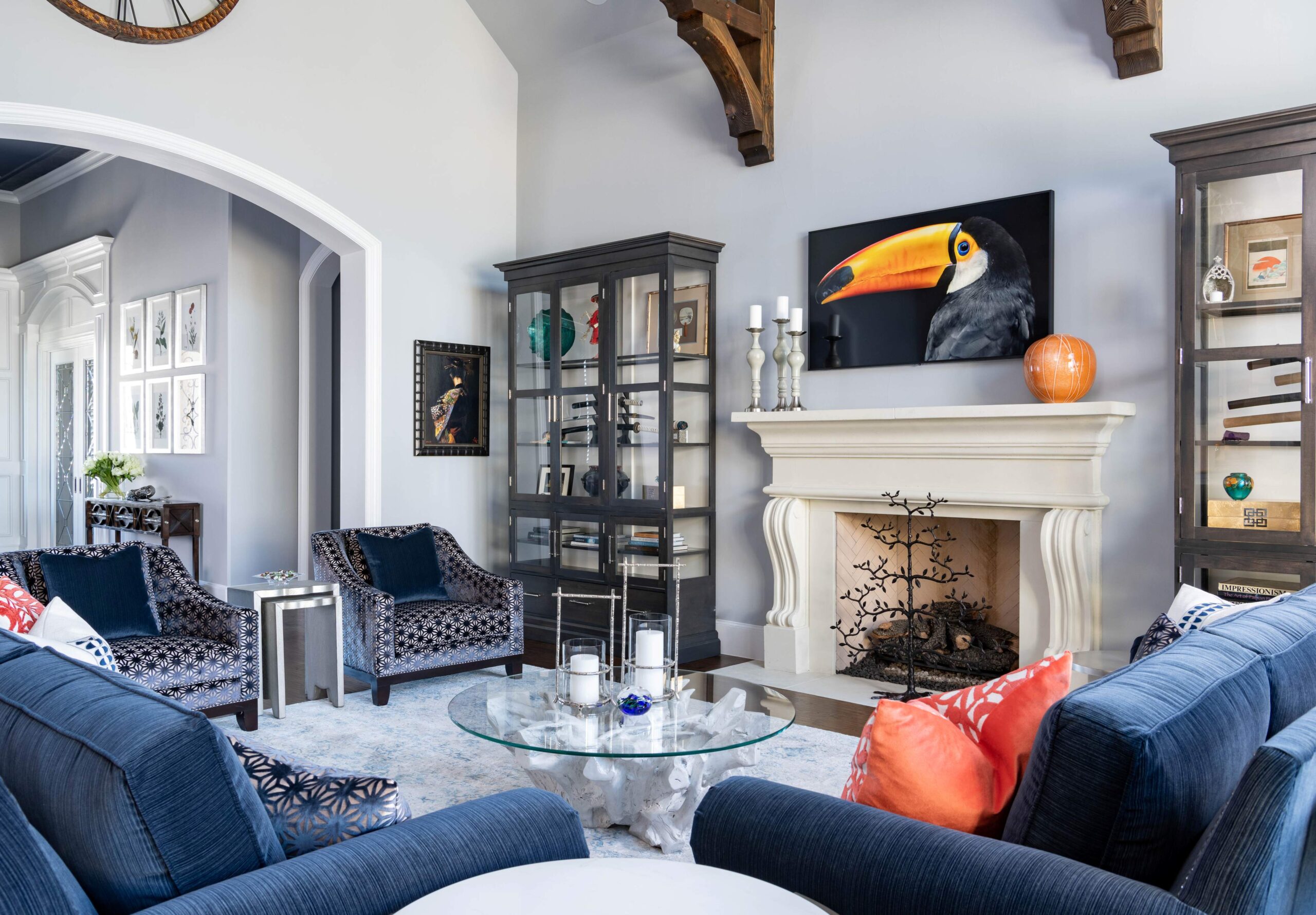
Cool linen? Retire it for now. Bring in velvet, chenille, corduroy, or boucle. Add plaids and autumn florals—yes, even with a modern twist. Don’t be afraid to layer. If your space has navy or deep blue as a base, offset it with pumpkin, caramel, harvest gold, or fig tones for a balanced contrast.
Why a Fall Palette Matters: Your Home’s Mood Starts with Color
Color quietly—but powerfully—sets the tone for your home’s energy. When paint, texture, metals, and light all work together, rooms feel inviting, sophisticated, and livable. Walk around your home during golden hour and ask:
“Where could I add just one degree of warmth?” Maybe a lamp here. A pillow there. A well-placed art swap. Tiny shifts, big impact.
Need help bringing your autumn vision to life? Whether you’re updating one room or preparing your entire home for cooler days, we’re here to curate a fall palette, guide your selections, and make your home feel effortlessly elevated.
Autumn design isn’t about starting over—it’s about layering what you already love with thoughtful, seasonal touches. A soft throw draped across your sofa, a candle with warm spice notes, or a textured rug underfoot can instantly transform your space. These details not only create visual interest but also invite comfort, signaling that your home is ready for cozy gatherings and quiet moments alike.
Ready to start your fall home decor project?
Tell us a little about yourself and your interior design project here. We look forward to helping you with your next home design or home renovation project.
Here are three other interior design blog posts that we think you might like:
- 5 Easy Ways To Create a Modern Kitchen Design | Luxury Interior Designer Dallas TX
- How to Modernize a Dark Drab Dining Room | Top Art Deco Design Dining Ideas 2024
- How To Downsize & Transition To Retirement Living In Del Webb Texas Communities


