Color is the invisible rhythm behind every room. It’s not a final flourish—it’s one of the first crucial decisions. In the natural world, we are conditioned to react to certain color combinations, and this holds true inside a home. At Twilly & Fig, we treat color one of the most impactful elements in interior design; not because it demands attention, but as it quietly sets the tone for how a space feels, functions, and flows.
From the warm curve of a caramel leather chair to the chalky white of a Venetian-plastered wall, color does not only dress a room—it builds an emotional connection. Whether the goal is serenity, sophistication, joy, or drama, color is where we start to set the tone. Whether your color preferences are bold and color or soft and neutral, At Twilly & Fig, we approach color in interior design as a foundational element—one that shapes the home’s livability, soul, and overall emotional connection.
Why Color Is Foundational, Not Decorative
That’s why we never treat color in interior design as an afterthought; it guides the way each room feels long before fabrics or furniture enter the conversation.
Color affects everyone in immediate, emotional ways. When a guest enters your home, before they have even begun to process the scale of a space or the architectural details, they’ve already reacted to the mood the color has created.
In our design process, we often guide clients to think less about their “favorite color” and more about how they want their home to feel. Once we establish that emotional baseline, everything from wall color to cabinet finish to textile selection falls into place with purpose.

What Colors Say Without a Word
Each hue speaks a language—historical, emotional, and psychological. The effects of color can change or influence the body. Here’s how we often interpret color when designing for real life:
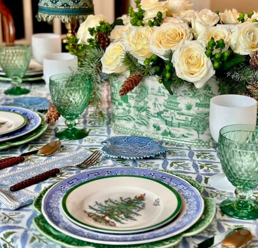
- Green is nature’s neutral when it comes to color. It evokes health, balance, and a sense of rooted calm. We use sage, olive, or moss in living rooms, libraries, and entryways to create depth without heaviness. Go bold and evoke the serenity of the deep forest with an emerald green.
- Blue brings peace. Pale blues are fresh and airy, perfect for formal living spaces, bedrooms, and bathrooms. Navy, on the other hand, adds structure and trust—ideal for studies or kitchens with rich finishes.
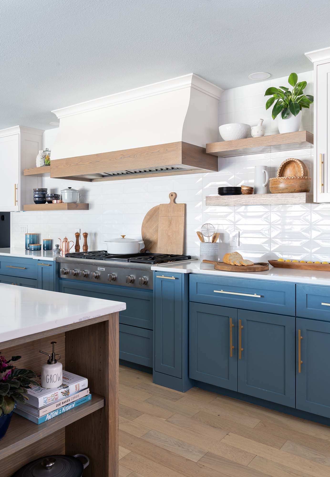
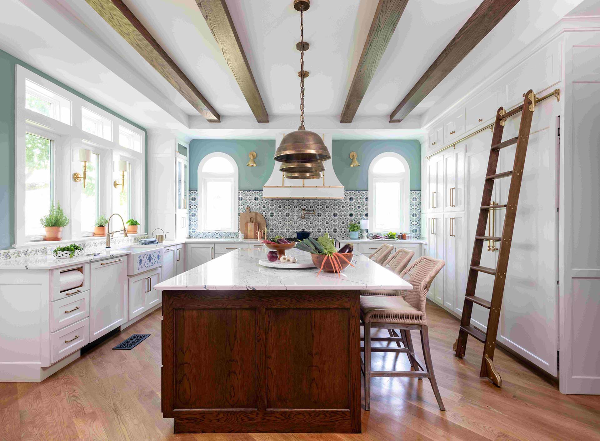
- Yellow signals energy and optimism, and is considered bright, sunny and a happy color for a kitchen. However, it is best used in moderation and in the right tone as it can evoke strong feelings and increase irritability when overused in a room.
When it comes to a children’s room it can be too bright and abrasive if not used correctly such as a soft butter yellow. We often limit it to artwork, textiles, or florals to bring a cheerful touch without overstimulation.

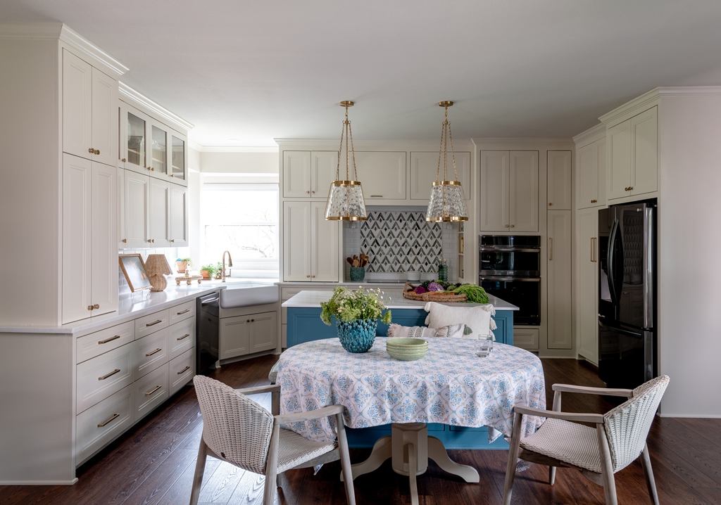
In this kitchen we used a buttery, yellow and contrasted with a deep, sapphire blue. The white cabinets on the outer walls kept the yellow from overpowering the space. The white textured backsplash also keeps this kitchen light and airy. This client loves waking up to a bright, sunny kitchen.
- Red exudes passion and power. Deep burgundy or rust-toned reds work beautifully in dining rooms, powder baths, or social spaces where energy is welcomed.
- Pink ranges from innocent to sophisticated. Muted pinks, like blush or dusty rose, can soften a room’s edge without making it overtly feminine
- Violet is a regal color, associated with royalty, wealth, wisdom, spiritually as well as exotic.

- Brown anchors a space. Whether it’s a deep walnut, mid-tone oak, or warm camel, it makes a room feel lived-in and grounded. How you incorporate this color is important and what you do to connect it to other colors in a space as it can also create a feeling of isolation, sadness or loneliness.
- White is about clarity and light, but it’s rarely that simple. The undertone—blue, pink, yellow, grey—completely changes how it feels and interacts with other colors around it. We often test four to six whites before landing on the one that works within a home. Exposure to different lighting can make a white feel different from home to home.
- Grey gives restraint and sophistication but can reflect differently once in a room. A layered grey palette—warm greys, charcoals, greige—is timeless and textural. A cool-toned grey can appear almost blue in certain exposures. It can be a complex color to select but can be beautiful when used correctly.

- Black adds discipline and contrast. It sharpens a palette, helps delineate form, and adds visual depth. We love it in fixtures, trims, or matte cabinetry. Black and ivory or black and white can be a beautiful combination but can also be read in two different styles from traditional to modern. We love black, ivory and gold within a room, but one could go as bold as black, white and fuchsia.
Designing for Emotion, Not Just Aesthetic
When we understand what a client wants to feel, color in interior design becomes the tool we use to shape that experience.
When clients tell us they want a “relaxing” bedroom or a “cheerful” kitchen, we hear color cues. Here’s how we use color to shape common interior moods:
For calming and restorative spaces:
We combine low-contrast tints of cool hues—spa blues, soft greys, misty greens. The color shifts gently throughout the day, never overwhelming the senses. In this recent home project, we used plum, sapphire, aqua to teal, grounded with a greige. See the link to this full home project following this blog.
This fabulous rug that we selected for the foyer set the tone for the rest of this full home project. You can follow the colors from the wallpaper in the dining room and continue down through the foyer to the beautiful kitchen and living room. We love it when a rug in the foyer can bring such a striking color pallet to welcoming into a home.

For nurturing and cozy rooms:
We bring in soft warmth—peach, blush, sand—often layered with warm white walls and plush textures. These spaces envelope you like a hug.
For high-energy or social zones:
We use bold contrast—deep navy with crisp white, rust with beige, hunter green with brass accents. These combinations spark conversation and evoke whimsy.
For formal or elegant spaces:
We focus on tone-on-tone layering. For a more neutral palette, Greige walls, bone upholstery, brushed nickel finishes, and one rich statement—like an oxblood rug or charcoal velvet banquette. For a bolder aesthetic, rich plum color drenched walls, soft velvet camel colored upholstery and brushed brass metals mixed with rich wood tones.
For playful, creative areas:
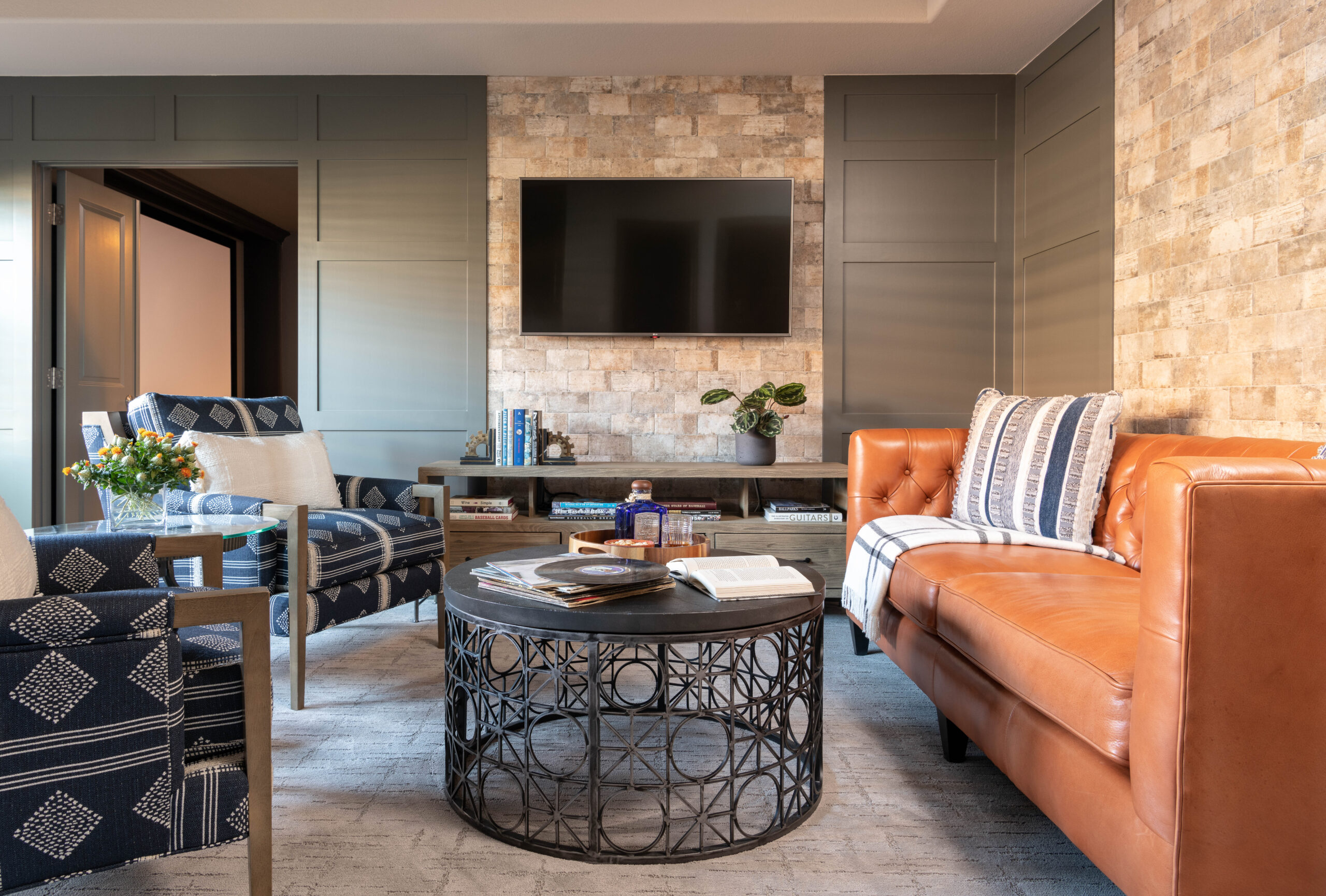
We embrace contrast and pattern. Citron, turquoise, coral, navy—used in textiles, art, accents, or geometric wallpaper—bring a sense of joy and movement. Depending on your style, a pop of pattern and contrast here and there is appropriate for a more clean-lined, minimalistic space, whereas pattern on top of pattern with a splash of more pattern works for a more maximalist one.

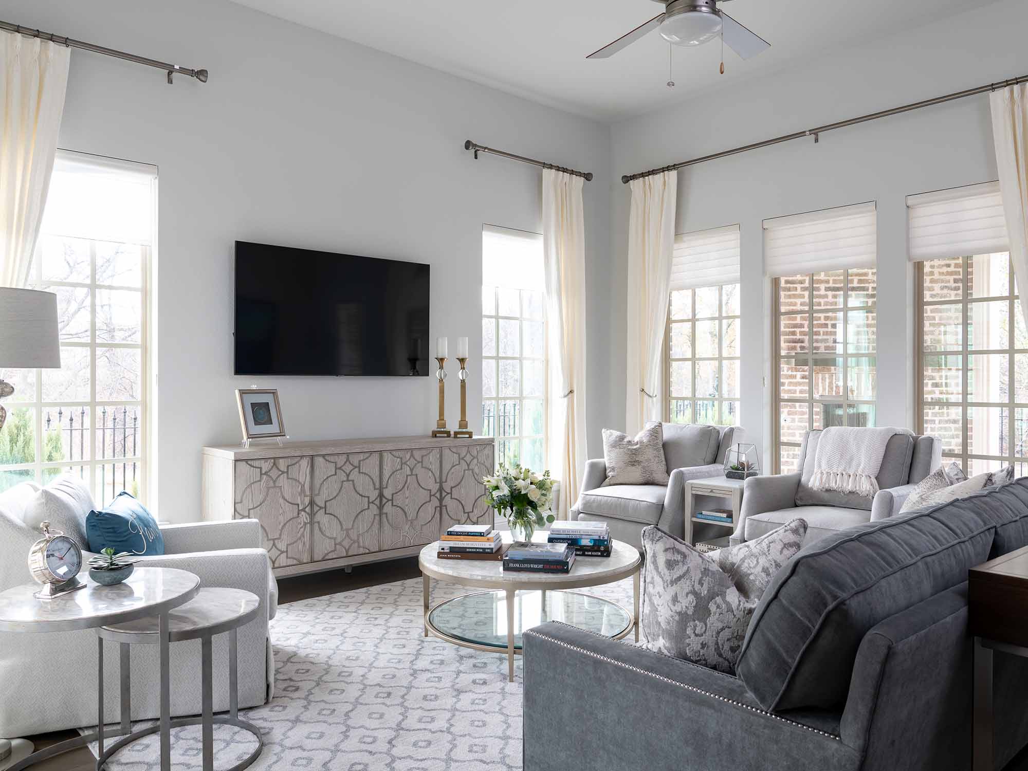
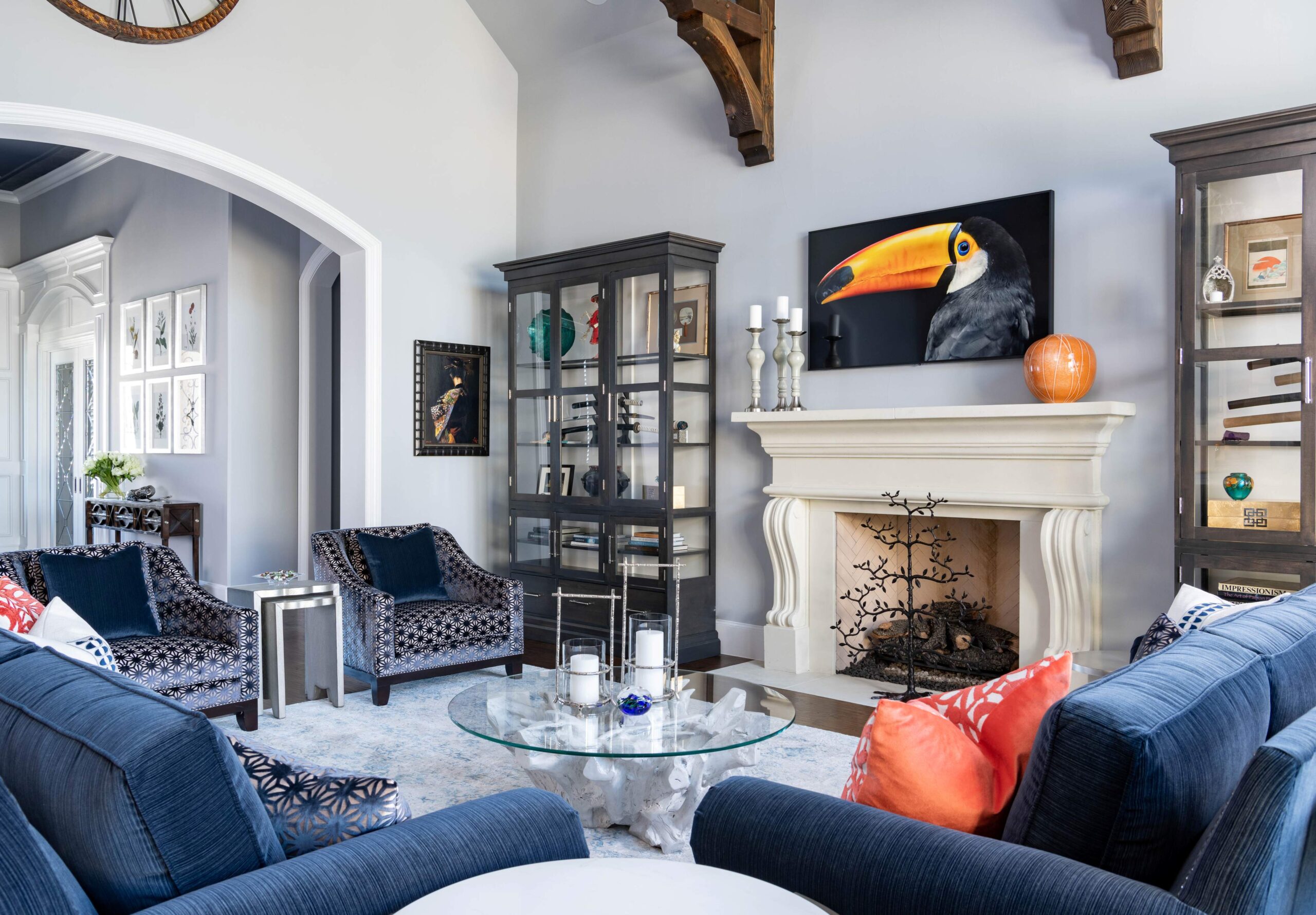
As you can see from this living room, we used a variety of patterns and colors to bring together a soft, formal but comfortable living room for enjoying listening to music or having a conversation with friends.
How Color Affects Space Perception
Color does not just affect mood—it changes how we perceive scale. We use this knowledge to enhance both large and small spaces.
- In small rooms, we often use soft, mid-toned hues that reflect light without flattening the space. Muted greens, warm greys, and earthy tones make compact rooms feel welcoming, not confined.
- In tall or vaulted spaces, we sometimes deepen the wall or ceiling color to bring the proportions into balance. A darker hue grounds a space and creates intimacy in an otherwise expansive volume.
- To elongate a space, we use similar tones across walls, trims, and ceiling. This removes visual breaks and makes the room feel more continuous.
- To define zones in open-concept homes, we assign subtle shifts in color or material. A dining area may feature a slightly darker wall or ceiling tone, while the kitchen remains crisp and bright.
Understanding the Core Elements of Color
- Hue: The basic color name—blue, red, green.
- Value: The lightness or darkness of the hue.
- Tint: A hue mixed with white, resulting in a lighter version.
- Shade: A hue mixed with black, making it deeper and moodier.
- Intensity: How saturated or muted the color is.
- Undertone: The subtle hue beneath the surface—critical in white, grey, and neutral.
Building a Whole-Home Color Palette
We approach color holistically. Rather than choosing each rooms palette in isolation, we create a whole-home color story that flows from space to space. You can see this in our whole home project – Frisco Lakeshore Retreat.
Here’s how we build it:
- Start with 2–3 anchor colors you love and can live with every day. These don’t all have to be bold—think warm taupe, deep olive, soft black.
- Layer in supporting tones—colors that connect to the anchors, such as complementary neutrals or soft accent hues.
- Assign colors by function and light. Use cooler tones in naturally bright rooms, warmer tones in darker ones. High-traffic areas often get mid-tone walls that masks wear better than pure white.
- Repeat and vary. Repeat color families across different rooms but shift the depth or finish to keep things fresh.
- Ground with consistent trim and ceilings. Keeping these elements, cohesive helps maintain flow, even as wall colors shift.

In this luxury living room, we used a neutral palette. The room is light and airy yet still feels comfortable and welcoming through the textures of the fabrics, pillows and throws. The artwork brings in calming colors of blues with a touch of warm neutrals to compliment the champagne cocktail table. This full home represents how to design a neutral home palette..
Color Mistakes to Avoid (and How We Solve Them)
We’ve seen color go wrong in many ways—here’s how we steer clients away from:
- Using too many “favorites.” Just because you love blush, emerald, and cobalt doesn’t mean they belong in one palette. We edit with restraint.
- Ignoring lighting. Paint can look radically different depending on exposure and bulb temperature. Always test in real conditions. The sheen that you select for the walls can also impact differently on the richness of a color. We love to hang sheet samples that we receive from Sherwin Williams or Benjamin Moore. They are both our go-to paint colors in our area of Texas.
- Matching everything. Matchy-matchy spaces feel flat. Contrast when done right, adds visual energy and depth.
- Using trendy colors without balance. A 2025 “color of the year” might date your space quickly on its own. We balance trend-forward accents with timeless foundations.
- Overlooking finishes. The color in matte paint reads differently than the same color in lacquer or velvet. We test across materials.
At Twilly & Fig, we solve these issues by leading with intention, not impulse. Color should feel effortless—never forced.
Our POV: Color Comes First
Color isn’t the last step, it’s the first. Every space we design begins with a story, and that story is told through color—how it moves through the room, how it interacts with light, how it makes people feel.
Danielle and I do not believe in rules—we believe in rhythm. We listen to the home, letting color lead. Whether it’s a home wrapped in warm organic tones or a penthouse with sharp contrast and saturated drama, the color sets up the mood, tempers the volume, and gives the space its voice. We always want a home to have a couple of emotions when you walk through the door – a “WOW!!” or “Oh, wow!”. We want the personality of that homeowner to come through as soon as you walk through the front door.
So, the next time you think about paint swatches or upholstery samples, ask yourself—not “What color do I like?” but “What feeling do I want to come home to?” What does your home say when you walk through your front door? Because that’s where a great design starts.